Making of Dotty Doughnut - Part 4
On composition and colour - a monster skeleton and roadside Americana

When I illustrate picture books, I pay particular attention to three pillars of C - Character*, Composition and Colour. The workflow of illustrating Dotty Doughnut (Orchard Books) was same as usual**: samples > thumbnail storyboard > rough sketches > colour palette and colour mapping > final artwork on Photoshop. So, in this last Making of Dotty Doughnut post, I’d like to share my inspirations behind compositions and colours in the book.
*Read the previous post for my ideas behind the character designs.
**Read Making of The Pet Potato for example.
Composition
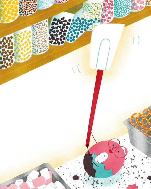
Although the illustrating process of Dotty was much smoother than writing it (read Parts 1 and 2 on writing Dotty), it wasn’t without trials and errors. For me, if something isn’t working visually, it’s usually something to do with the composition (and to an extent, pacing, such as page breaks, and layouts). I think composition is a very powerful storytelling tool and my favourite one (because my background is in film and TV). The right composition could elevate the story. Here’s an example:
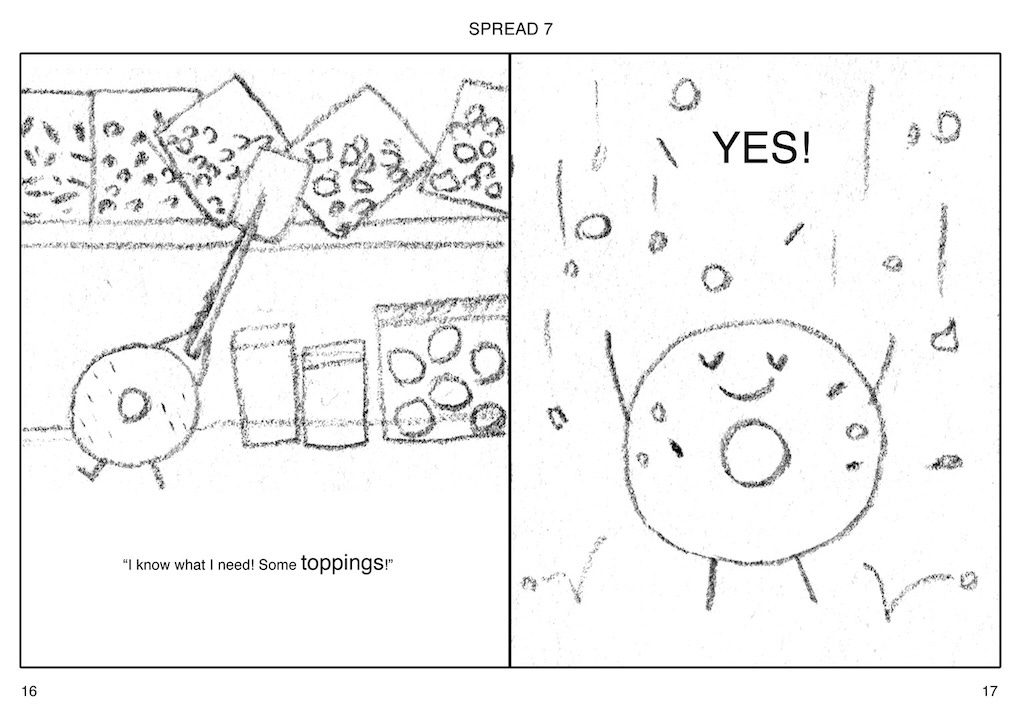
As you can see in the thumbnail and the first rough above, the scene where Dotty tries to get some sprinkles (LHS page) was initially drawn with a straight-on angle. Quite frankly the composition was stiff and boring and it was adding little to the story.
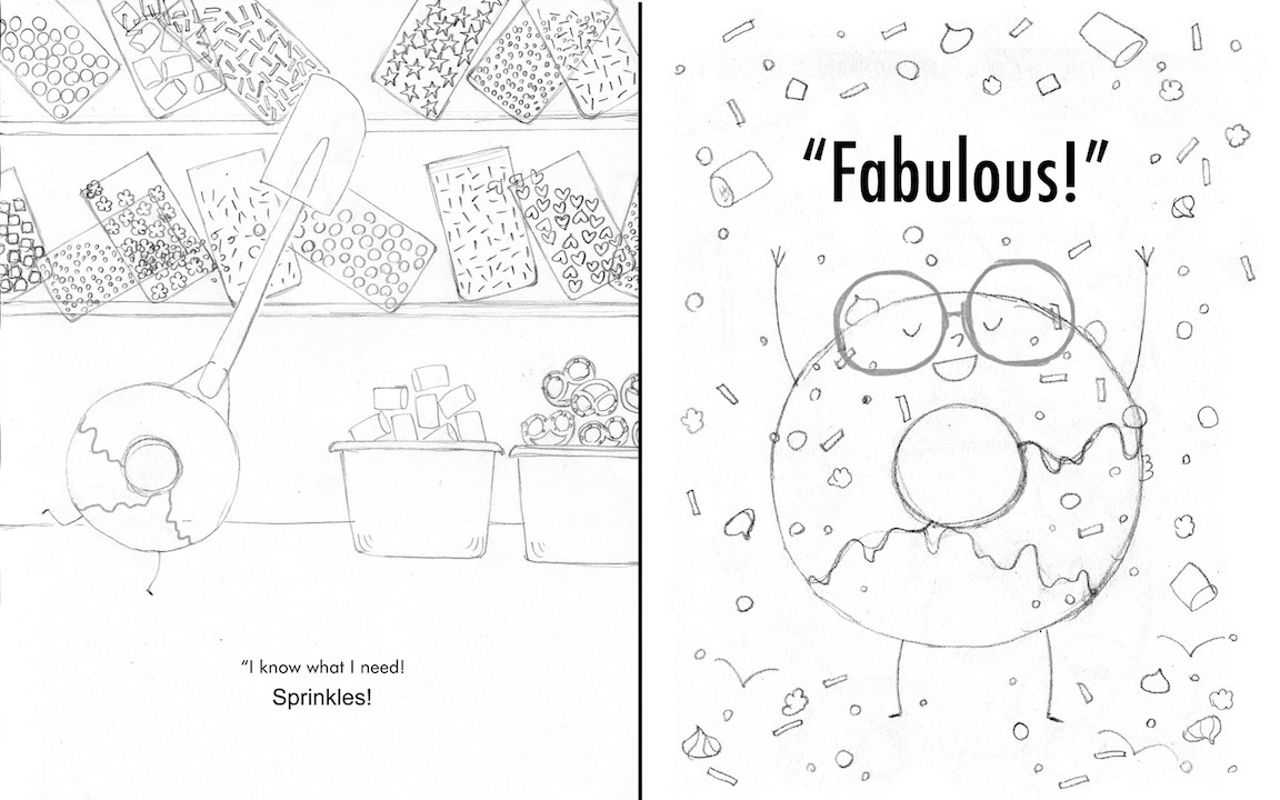
So I change it to a bird’s-eye view (looking down) angle. The angle allowed me to add more height, therefore more drama, and the following page (RHS) where the sprinkles rain down on Dotty consequently worked better. And it’s just visually more interesting. When I find a right composition, it’s a glass-slipper-fits-perfectly-on-Cinderella’s-foot moment.