Making of Dotty Doughnut - Part 3
On character design - to be filled, or not to be, that is the question

During my school visits, I often tell children that a story needs a strong character or the story won’t work. This post looks at how I developed the characters in my upcoming book, Dotty Doughnut (Orchard Books).
Dotty the doughnut
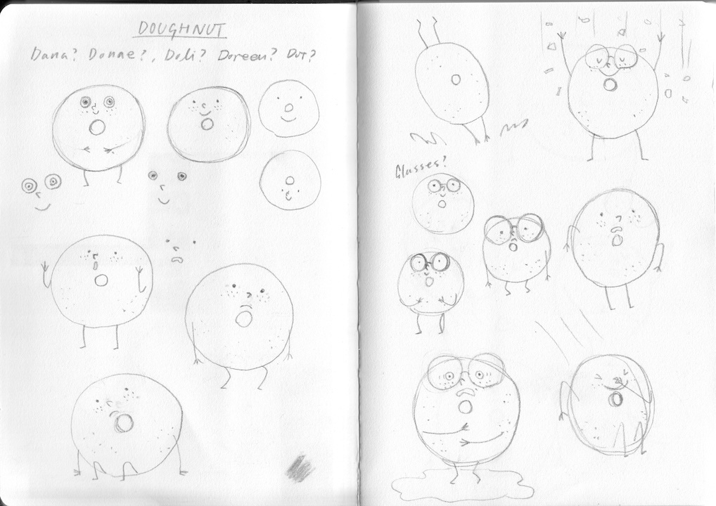
The titular character is a simple ring doughnut who wants to be fancy like the popular doughnuts on the top shelf of the bakery. As I mentioned in Making of Dotty Doughnut - Part 1, the story’s starting concept was “What’s inside that counts” and my publisher initially suggested a filled doughnut (e.g. jam doughnut) for Dotty. But I couldn’t visualise how to show she was a filled doughnut without opening her up (it’d be perfect for a doughnut murder mystery). Eventually I decided to distinguish filled doughnuts with a drop of filling on the top.


But I thought a plump filled doughnut wasn’t quite right for the story. The story is about looks (as well as personalities) but it’s not about body image complex. Instead, I thought an old-fashion ring doughnut would make a better contrast to the highly decorated, trendy doughnuts and it’d thematically make more sense (old-fashion vs trendy/popular).
Designing Dotty was quite straightforward (two circles with a face, really). Having said that, it took a bit to finesse details as a tiny change could make a big difference (e.g. shape and size of glasses). I initially drew her with tiny hole to secure a big space for her face. Then, my art director pointed out that she looked more like a bagel than a doughnut and she was right.